Post Up
Design Sprint
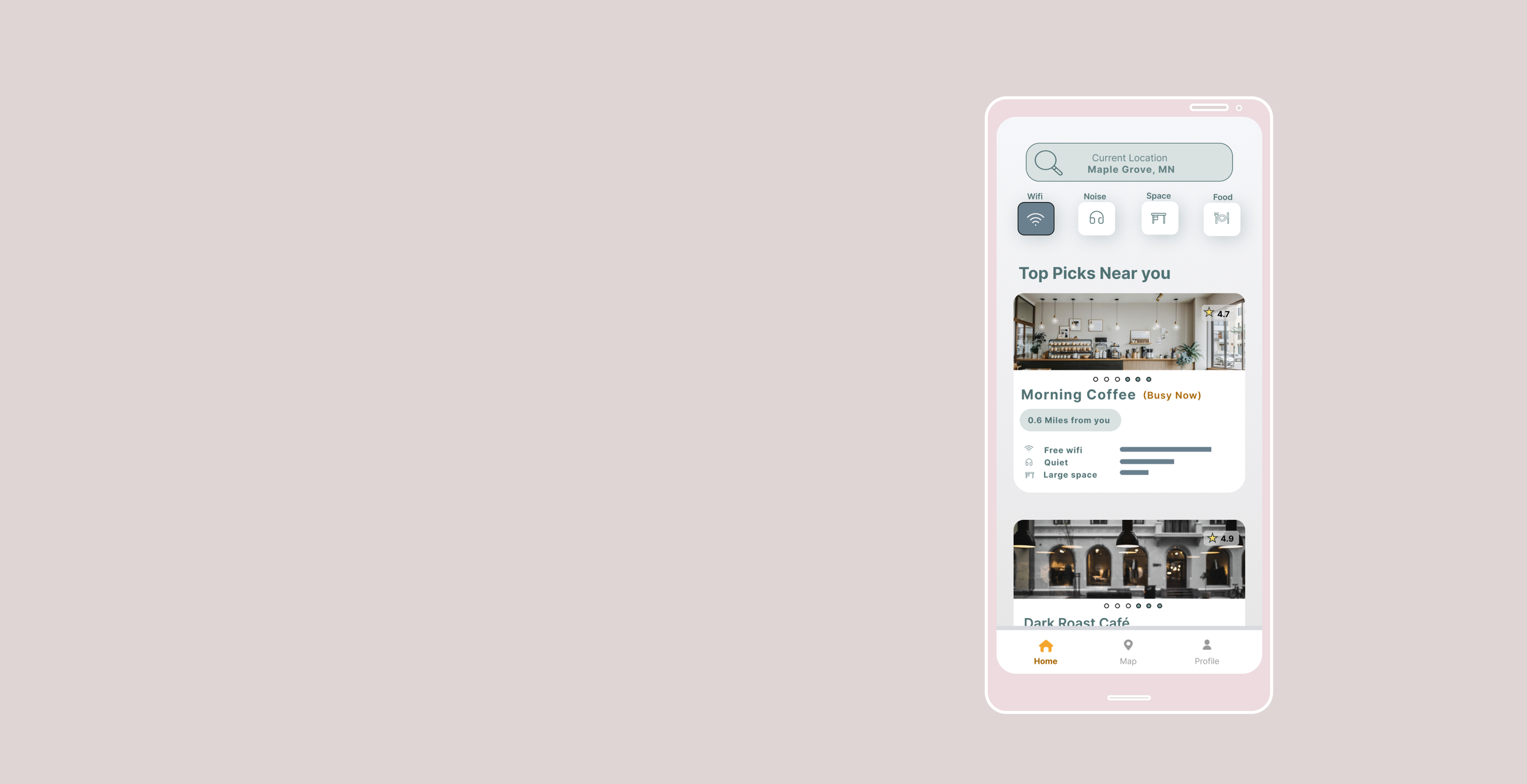
For this project I completed a 5-day Design Sprint for a mobile app called Post Up, following the Google Venture principles. Working to validate a design, rather than test and iterate, was much like testing a hypothesis. The design itself is not the focus, but the functionality.
Post up is a start-up that aims to make it easier for remote workers to find a place to work.
About
Finding the right remote workspace can be difficult.
Users struggle to find the right place on the go, spending time searching for a place that suits their needs such as Wi-Fi reliability, quiet workspace and location.
#PROBLEM
How might we create a tool that quickly gives users an overview of their needs.
#HOWAim to streamline the the process of finding a remote work place, saving users time and effort and while ensuring they find the right place that support their productivity.
#GOALCreate an easy-to-use app that helps users find the right workspace based on their need. Providing users with quick overview and live information.
#SOLUTIONPost Up started as an online community where users shared tips and tricks on how and where to best work remotely.
Users rely on other people’s experiences to get an understanding of how a place actually works.
User experience showed that there were many varying needs the user had in mind when looking for a remote workplace.
To get a better understanding of what users might be looking for multiple user scenarios was created.
Understanding the existing Post Up Community
Market research was key to understanding both what users expect and what the current competition is providing.
Applications similar to Post Up provided an overview but lacked live content—meanwhile more established apps for restaurants provided both suggested content and accurate live information.
Suggested and live content will help users get accurate and curated content quickly. This is key to creating simple, quick interactions for users can trust.
#TAKEAWAY 1Review and user information to give user social proof
Overview of suggested content for users to do quick “window shopping”
#TAKEAWAY 2Filter based on user need
#TAKEAWAY 3The storyboard helped narrow down the interactions.
it was important to me that users had as few interactions as possible, being able to scroll and quickly decide which restaurant fits their needs.
The storyboard helped me keep the screens to a minimum of 5, for the most critical red route.
Rapid sketching to explore a variety of solutions
To explore options and narrow down the best screen I sketched a series of crazy 8 sketches. This helped explore different solutions and incorporate findings from the secondary research.
With the timer set for 8 minutes, each sketch took one minute.
Users grasped the concept and were able to navigate through the app quickly
#TAKEAWAY 1Users found the review page helpful, but would like more clear metrics around the rating system
#TAKEAWAY 2 Presentation: too many details. User spent time observing the many information, keep the filter options and metrics simple.
#TAKEAWAY 3 Improving Visual Hierarchy by simplifying content
User testing showed that these interactions needed to be clearer so that users could quickly understand the content.
Removing the rating scales and adding numbers will help both with recognizability and improve the visual hierarchy.
Combining infomation in a more user friendly way
Users felt like there were too many competing details and were left unsure if they needed to explore further.
By removing the rating scale and featuring the highlights from the user reviewers with clear icons will help with visual hierarchy and allow users to have quick interactions without having to dive deeper into the reviews.
REFLECTIONS
FREEDOM TO MAKE MISTAKES
Spending 5 days to develop an app, with the understanding that not everything needs to be perfect gave me a sense of freedom.
Problem-solving with a focused solution and being able to rapidly test the product helped drive the solution in the right direction.
While the app had many details, the details helped me get the right feedback. Rather than spending time perfecting all aspects, getting user feedback early in the process and being able to prototype within such a short time frame was a very effective way to test and validate the concept.
5 DAYS DO IT ALL
while the rapid testing was a solid way of getting feedback, being limited to 5 days came with both its perks and challenges. A learning point for me was to let go of creating a perfect UI design and focus more on the concept itself. Had this been a longer sprint I would have continued to build out the concept and design.
However, it was a very effective way of finding solutions that resonated with the user through the testing.


