Interview AI
Client Assignment
AI-powered interview tool aims to simplify candidate & interview screening and talent identification for organizations.
About
For this project, I partnered with 2 UX designers to transform our client’s company website to a more intuitive user-friendly site to contribute to conversion rates and user engagement.
The current web page lacks intuitive user design and user flow and may hinder attracting and engaging users, making it difficult for users to understand core features and capabilities.
#PROBLEM
Web page lacks intuitive user design and user flow and may hinder attracting and engaging users, making it difficult for them to understand core features and capabilities.
#PROBLEMRedesign website to help users understand the content easily and provide them with clear direction and call to action
#SOLUTIONHow might we increase user discoverability of core features sparking user interest and promoting them to explore the site further
#HOWMeeting the client the UX designers
We started by using FigJam to map out the project scope and align with the client’s needs.
After establishing a plan, we divided tasks based on our strengths. Since our team had never worked together before, setting up a clear workflow was essential.
With an international client and our team spread across the U.S., FigJam became a key tool for seamless communication and collaboration.
Understanding the client and their customers
When meeting with the client, we asked key questions to understand both their goals and customer base.
We focused not just on the end goal but on the overall experience to ensure a seamless user journey.
Anticipating User Questions for Transparency
Research shows AI in Talent Acquisition is booming, with some established leaders.
A key trend: explaining how AI matches or surpasses human results.
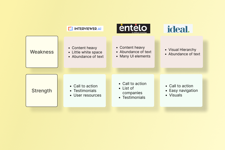
We began with a competitive analysis to identify trends, product offerings, and useful features for our structure.
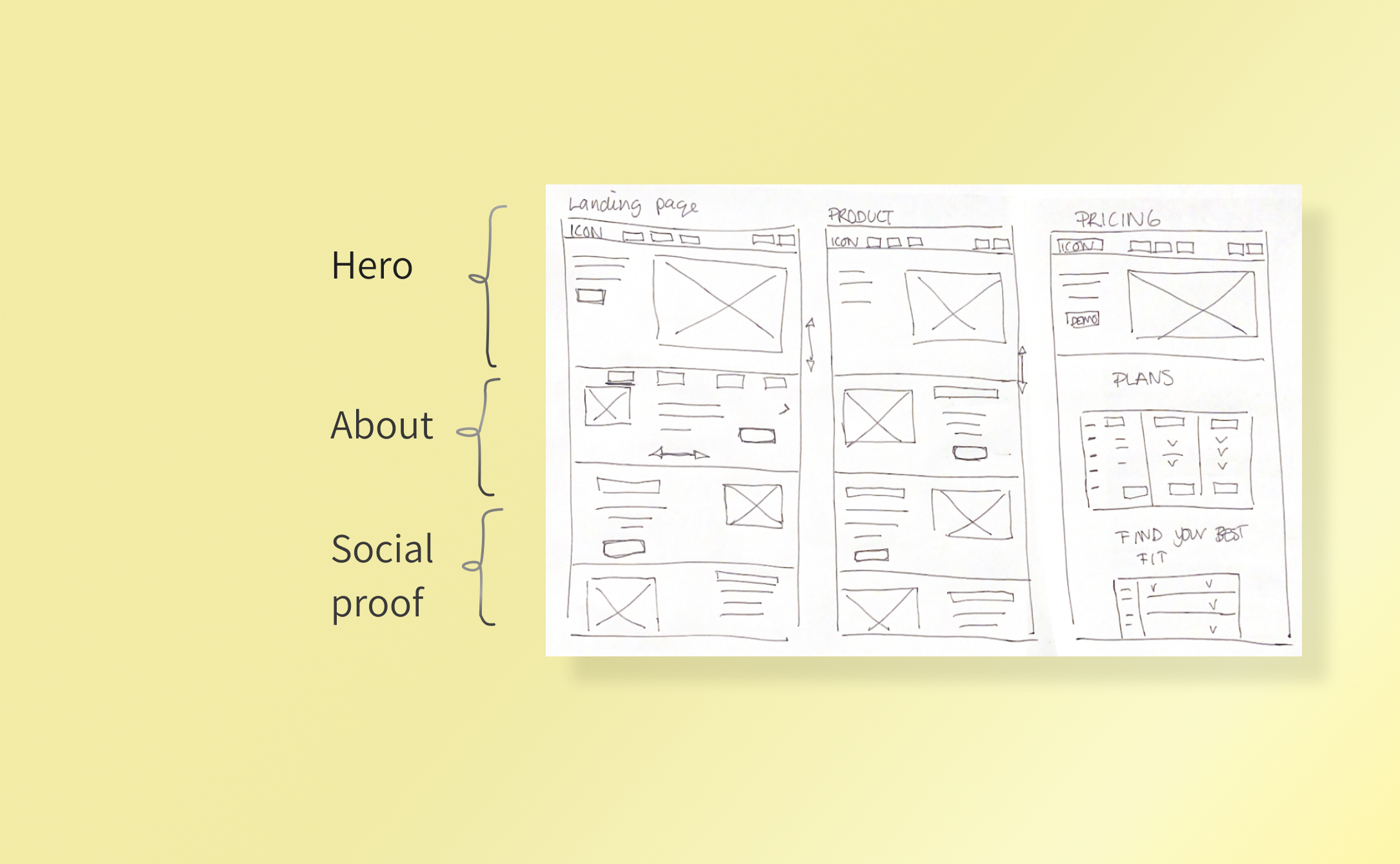
Sectioning content into smaller pieces to make it easier for users to digest
Ensuring all roads lead to the sign up button
During the initial meeting with the client we asked what their main goal was with the website, “Get people to sign up for the demo”.
So during the user flow and site map, it was important that this was the case, and that it stood out properly in the design.
Scannability. Visual hierarchy is key. Sites that utilized white space, and balance in visuals and text had a more effective way of telling their story
#DESIGN DECISION 1#DESIGN DECISION 2Build trust with transparency
#DESIGN DECISION 3Less is more. Don’t overwhelm the user. Use familiar patterns and content blockers
Crafting a user-friendly narrative to explain how the AI tool works.
Focusing on clearly sectioning the content to create a better visual hierarchy, ensuring users are not overwhelmed with information.
By making the tool’s functionality transparent and straightforward, we aimed to eliminate user questions and concerns. providing a clear and simple explanation of how the tool would work in real life.
User testing
User testing we had 3 goals.
Feedback on clarity on the landing page.
Call to action: Users will explore the site and point out what the next step is.
Fill out the “sign up now” form.
While we had spent most of the time on the content and landing page, we received the most feedback on the form.
#TAKEAWAY 1 Show empathy for the user when you’re asking for their information. Be clear on what they are signing up for.
Progress indicator on the field. For every action there should be a UX reaction.
Call to action overall clear. however, be transparent in what you do. Don’t use vague text or sales pitch.
#TAKEAWAY 1 #TAKEAWAY 3 REFLECTIONS
INFLUENCING THE CLIENT WITH GOOD UX
Our client had a lot of focus on UI, and UI elements they wanted to include.
As a team, we spent a long time on colors, mood boards, pictures, and other visual aspects.
However, colors and pictures come down to personal preference. While UI is important to UX, good UX comes from research.
Learning that some of the best UX sites don’t have the most interesting design, but are more focused on the experience than the visual aspect was a great learning. Influencing the client to forego personal preference and listening to our UX data for our decisions was a great experience.
ADAPTING TO CHANGES THROUGHOUT THE PROJECT
One of the biggest takeaways from this project was the collaboration with other designers.
Being able to play on each other strengths and experiences helped move the project forward quickly.
However, something that came up during this project was dealing with ambiguity. When we dealt with ambiguity we had different comfort level changing the original plan and dealing with client feedback.
We had strong opinions on the team, and it became important to communicate and keep the project moving forward. Leaning on soft skills to navigate and meet deadlines kept us moving forward.
Being able to listen to concerns and address them and using collaborative tools such as Figjam kept us on track.


